KAIBIGAN PILIPINO
Building a Website from Zero for 1,000+ Members
ROLE
Design Lead
TEAM
6 Designers + 7 Developers
SKILLS
Design Systems
Team Leadership
Wire-framing
Developer Handoff
Responsive Designer


Why don't we already have a website?
Kaibigang Pilipino is one of the oldest Filipino-American student organizations at UC San Diego, with over a thousand members across three boards and multiple programs. For an organization this size, not having a central website meant members had no reliable way to track events, RSVP, find their board, or learn the organization's history.
This was my first time leading a cross-functional team: designers with strong UX instincts and developers who were still building their backend confidence. The challenge was not just designing a good website. It was designing one we could actually ship.
The goal was not just a good-looking website. It was a central system where members could track events, RSVP for prizes, follow their board's program track, and learn about KP's history. Though this did not make the cut for our MVP, we wanted to encapsulate a timeline that told the key events that put KP on the map.

Events and easy navigation:
A fixed navigation bar visible at all times, so members always know where they are and how to get back.
An events page with color-coded board categories: STAR for student retention, GEN for general KP activities, and CORE for higher education missions. Members could filter by what actually mattered to them.

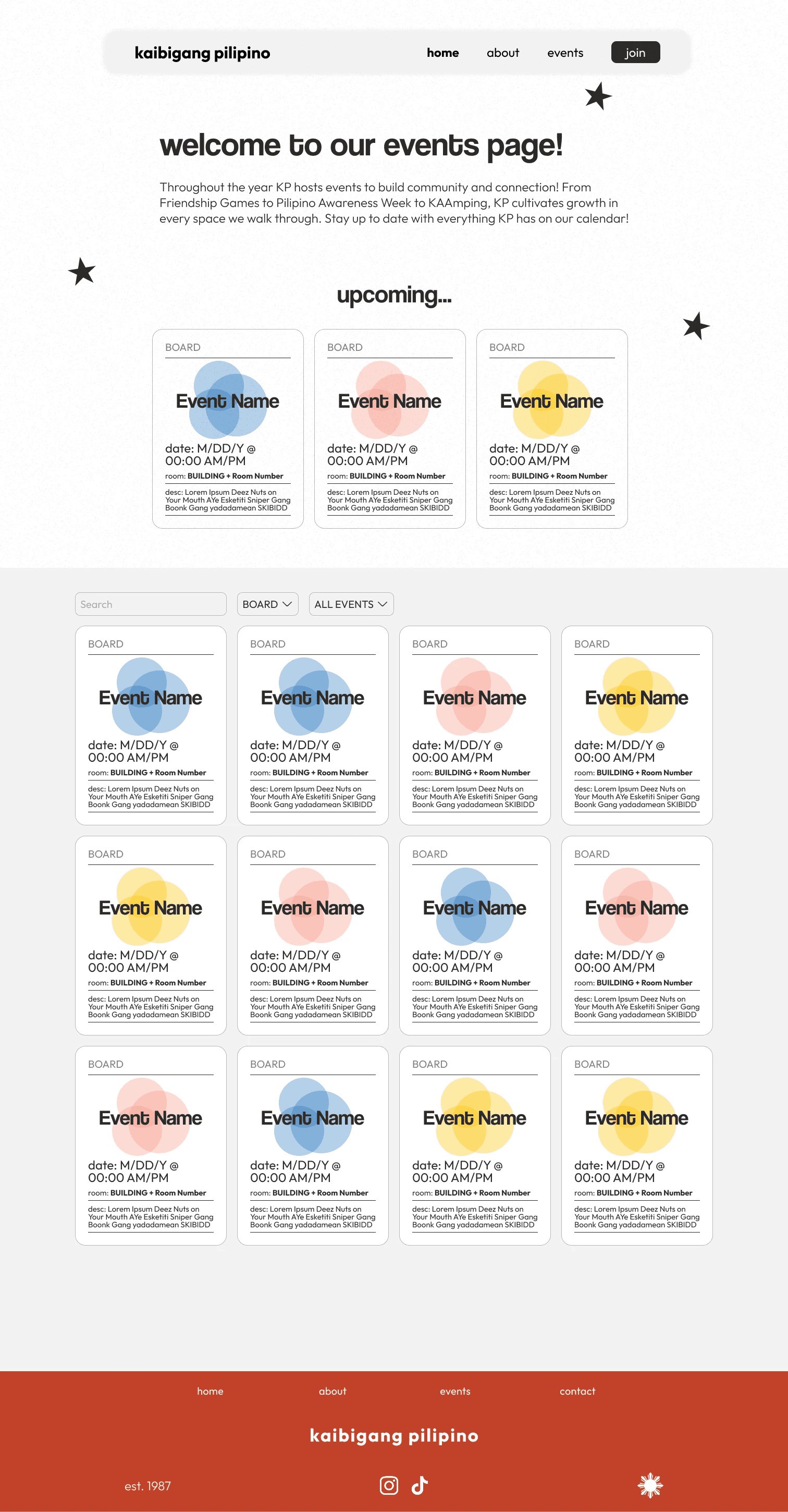
Identity through design
Community identity pages that brought KP's history and culture to life for new members discovering the org for the first time.
Our president, both product managers, and I all had strong UX backgrounds, so the ceiling for what we could design was high. But the bottleneck was never ideas. It was handoff. Most of our developers were building their first real web project and were still getting comfortable integrating frontend and backend into a single working system with authentication and security.
Our main focus for functionality came with:
Rather than scope down the design and ship something underwhelming, we scoped down the first release. We identified the features that would prove we could build and deploy something real, then drew a line. Everything above that line shipped in V1. Everything below it became documented backlog for the next team.
That framing changed the dynamic between the two groups. Developers were no longer trying to keep up with designers. Both sides were building toward a defined target they had agreed on together.
Sprints. Sprints. Sprints.
Sprints were non-negotiable. With designers and developers at different skill levels, we needed a structure that let us test ideas fast without overcommitting. Designers could push creative boundaries inside a sprint, then we would negotiate trade-offs together before anything went into handoff.
My role during this phase was working directly with the design team to finalize wireframes before they reached developers. That meant reviewing every screen not just for design quality but for catching interactions or layouts that would stall a junior developer before they became blockers.
Responsiveness was built in from the start. As students, our members are constantly switching between laptops, tablets, and phones. Designing for all three from day one meant we could change the visual direction later without breaking layout. It also gave developers a consistent set of constraints to build against instead of a moving target.


Setting up a design system
We established the design system early: typography, color tokens, component states, all documented in Figma before a single line of CSS was written. The system was not just for us. It was for whoever inherits this project next year. Every component, every spacing rule, every color decision is documented so the next design lead does not have to start from zero the way we did.


A Bright Future
The site shipped and went live for over a thousand members. Events, RSVPs, board information, and KP's history are now all in one place for the first time.
But what I am most proud of is not the product. It is the handoff. The design system, the component library, and the documentation were built so that next year's team has a foundation to iterate on, not a blank canvas to restart from. For an organization that has existed for decades without a website, making sure this one outlasts the team that built it was the whole point.

My Key Takeaways
What I would do differently: I would make the design system more developer-facing from day one. We built it as a Figma artifact first, then spent time re-translating it for developers. That translation step is where most of our sprint friction came from, and it could have been avoided with shared documentation from the start.
What I am taking forward: the instinct to scope honestly. It is easy to present a polished vision. It is harder to draw a line that your team can actually ship against, and then hold it. That skill of knowing where the line is and being willing to set it, is what turned this from a design project into a real product.